Following up on yesterday’s chart showing gains in fuel economy since 1975, today’s chart shows annual average gas prices, adjusted for inflation to 2013 Dollars.
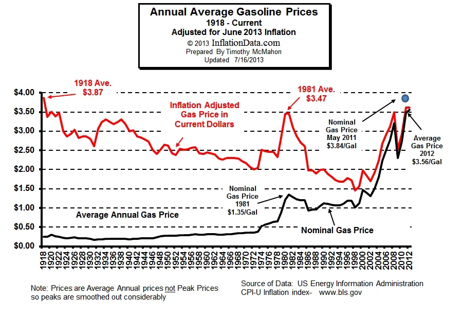
The most striking thing about this chart is that gas prices maintained all-time lows (under $2/gallon in 2013 Dollars) for roughly two decades – from the mid-1980s to 2003. It’s certainly no coincidence that a whole lot of sprawling land use was built during that same time period. Just imagine if real gas prices had never subsided from their 1981 highs.
If you’re looking for a gas prices chart to compare more directly to yesterday’s chart of fuel economy since 1975, this chart has a similar X-axis:
