 Last year, I dove headfirst into the Nice Ride dataset and compared the bike share usage in each downtown. At the time, I argued that the large disparity between downtown Minneapolis and downtown Saint Paul meant that the city needed to be a lot more aggressive about building bicycle infrastructure.
At the time, one of the many thoughtful comments that appeared on Streets.mn was that the comparison was a bit premature, and probably unfair. Here’s one example:
Overall I think this is right on. Downtown St. Paul could have much better infrastructure for bikes. Two things come to mind though:
1. Did the Downtown St. Paul stations open at the same time as the Downtown Minneapolis stations last year? Nice Ride tends to open the new stations a month or so later than the stations that existed the previous year. The St. Paul stations may have had a shorter season than Minneapolis.
2. I’ve got to imagine there’s a bit of maturing to the system. I find I have a much better idea of the station locations that have existed a year or two and how I can use the system to get where I want to go. Areas that are new may have a bit of a learning curve for people to find out how the system can work for them.
I wonder how a 10 station comparison might look between the first year of Downtown Minneapolis service to the first year of Downtown St. Paul service.
As per usual, Streets.mn commenters make excellent points. So now that the 2013 Nice Ride data is available, I thought I’d take a look at the comparison one year farther on. Did Saint Paul’s downtown ridership grow?
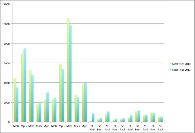
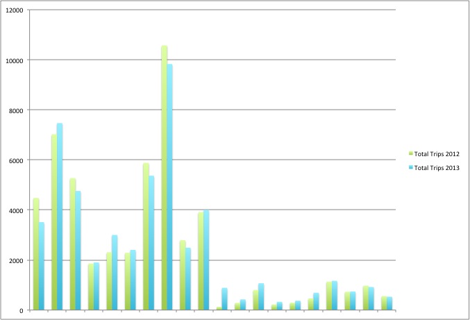
10 Stations in Each Downtown: 2012-2013
2013 Numbers
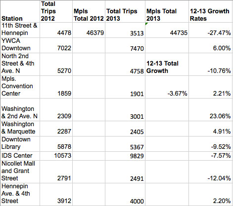
2012-2013 Downtown Data: Minneapolis
The ten stations I looked at in downtown Minneapolis actually saw a decrease in ridership of about 3%! Who knows why this happened. Could have been weather or maybe just some statistical noise. Maybe the market is saturated?
But, overall Nice Ride ridership in downtown remained high. The IDS center station is still the #1 Nice Ride location in the whole system (though the station on St. Anthony Main is rapidly catching up). Some of the spots saw a lot of growth (especially the station at Washington and 2nd Avenue North), and a few declined (the library, another North Loop spot). The total ridership at the ten stations in my sample was about 45,000 for the whole season.
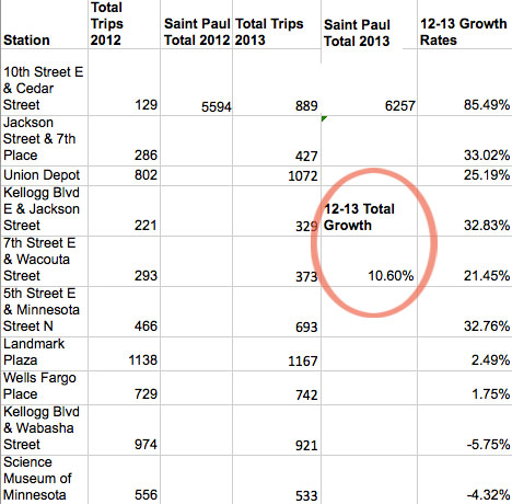
2012-2013 Downtown Data: Saint Paul
Meanwhile over in downtown Saint Paul, ridership grew 10% over the (shorter) 2012 Nice Ride season. Some of the stations saw dramatic increases (especially 10th and Cedar), and usage grew at practically all of the ten locations except for the two along Kellogg Boulevard. The Landmark center remains the #1 Nice Ride location in all of Saint Paul, with about 1,100 trips during the season.
That said, Saint Paul ridership is very low compared to the Minneapolis part of the system. Looking at the two downtown populations, we might expect something like a 4:1 ratio between ridership numbers, but instead we see a 7:1 ridership gap (45K in Mpls v. 6200 in StP). Granted, that’s a bit better than last year, but with a longer Nice Ride “season”, you’d have to expect some growth. It seems that pretty much everything I said in April’s post remains true in 2013.
Maybe Next Year?
In order to build ridership and make the most out Nice Ride’s investments in Saint Paul, the city needs a network of bike lanes, and to ensure safe and comfortable bike connections between the downtown and the surrounding neighborhoods. (For example, see my earlier post on bike lane gaps at bridge approaches.)
One of the nice things about doing data analysis is being able to return to it, year after year, with updates. It’ll be interesting to see what 2014 brings, when the (long awaited) light rail begins running through downtown Saint Paul. Until then, it seems like the capitol city is still getting lapped by its larger Western twin.
Nice Rides in St Paul’s #1 most interesting alley.