For those of us that are dedicated urbanists, it is something of an article of faith that density is good. Is it good? How do you measure ‘good’, anyways?
One way to measure ‘good’ is to see if people want it. Are people moving to cities? Are denser areas growing as fast as less dense areas? This is a widely discussed topic among the urbanist blog-o-sphere, from William Frey’s updates at Brookings to Joe Cortright’s coverage at CityLab and City Observatory. But what those analyses lack is an assessment at a fine geographic level. Phoenix is a massive city covering 1300 square km; Houston is even bigger, almost the size of Hennepin County. Counting people living in the ‘suburbs’ of Phoenix or Houston as city-dwellers just because they live inside the county-sized city limits does not make for effective comparisons with smaller Eastern cities like Boston or Minneapolis.
Fortunately, we do have mechanisms for comparing smaller geographies that are independent of city borders. My preferred method is the zip code. The US Census Bureau does not release comprehensive zip code population estimates every year, the way they do for states, counties, and cities. But the American Community Survey does have estimates for 2016. By comparing 2016 and the 2010 census, we can get an idea of how each zip code in the US has been growing over the past 6 years. Grouping these zip codes by density, we can get an idea of the relationship between density and growth.

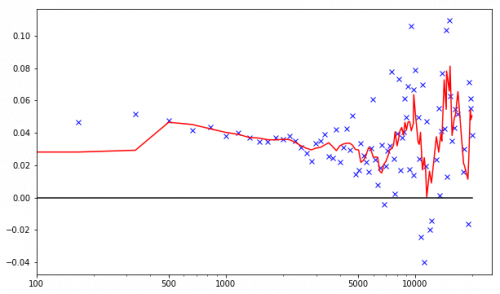
Population growth rate against zip code population density
This is a graph of population growth against zip code density, with zip codes divided into bins of about 200 people per square km. That means, the leftmost blue ‘x’ is the growth rate for all zip codes in the US between 0 and 200 people per square km. This rate of roughly 1.5% is the overall growth rate of rural america. The next blue ‘x’ to the right is all the zip codes between roughly 200 and 400 people per square km. This 4.8% growth rate represents small towns and the farthest exurbs. The red line is the population-weighted average of groups of five adjacent bins; it helps to smooth out the graph and see trends through the noise.
You may notice that the graph cuts off at 20,000 people per square km. That is because only New York City has zip codes above that density. If you want to see how fast Manhattan or Brooklyn is growing, you can just look on Wikipedia.
For density numbers comparisons, Elk River has a density of 200 people per square km, Lakeville is 570, and Roseville is 940. The densest part of the Twin Cities is zip code 55404 covering Eliot Park and Ventura Village, with about 6,000 people per square km. Uptown is a little over 4,500 people per square km; while Downtown Minneapolis plus North Loop is a little under 4,000. Most of Minneapolis and St. Paul are over 2,000 people per square km, as are the densest suburbs: Richfield, Columbia Heights, and Robbinsdale.
Whew, that’s a lot of numbers! I wanted to provide some local context for the numbers on the graph. In general, following the red line, we can say that suburban population growth is highest around 500 people per square km; specifically, the exurban edges of rapidly growing cities in the Sun Belt. Here is the same graph as above, but on a logarithmic scale so we can see the lower density parts more clearly.
Population growth against population density on a log scale
Growth generally decreases with density until around 7,000 people per square km, whereupon growth picks up again. Between 7,500 and 10,000 people per square km population growth is clearly higher than it is in any grouping that might be called the suburbs; the peak around 15,000 people per square km looks to be even higher.
One last chart will widen the size of the bins so that each bin is approximately 1000 units wide. Thus, the leftmost bin will have all zip codes between 0 and 1000 people per square km, the next one 1000 to 2000, etc. This helps smooth out the curves even more so we can make broader comparisons. Following the red line, we see that at high density, population growth is clearly higher than growth at lower densities.

Population growth against zip code population density with larger bins
The 6-year average growth rate for the 1,000-2,000 people per square km band is 3.67%. Meanwhile, growth for the 8,000-10,000 band is 4.41 %; and for the 12,000-16,000 band is 4.50 %.
The population density range of 1,000-2,000 is about as suburban as you can get; despite this, the majority of fast growing cities like Nashville, Austin, and Raleigh are in this density bracket. Far more people live in this population bracket than at higher levels; 58 million people live between 1,000 and 2,000 people per square km, while less than 8 million live above 10,000 people per square km. So the fastest magnitude of growth is occurring in suburban density; suburbs are adding more people than cities are. But, the density brackets with the highest growth proportional to current population in the US are all more dense than anywhere in the Twin Cities! These dense regions are strictly limited in geographical distribution: Seattle, Miami, DC, Boston and its suburbs Cambridge and Somerville, Los Angeles, San Francisco, Philadelphia, Chicago, and New York and its region. Only in Boston and New York do these fast growing, highly dense areas extend outside the limits of the main city.
The conclusions are these:
- The densest zip codes are growing faster than any density-based slice of the suburbs.
- The fast growing, dense zip codes are limited to only 9 large cities; and none of those cities is Minneapolis
There is no statistical evidence that the kind of density that exists in the Twin Cities is very attractive; growth rates at Minneapolis density are lower nationwide than growth rates at exurban density. However, the density you might find in the North Side of Chicago or Boston’s Back Bay is attractive in the sense that these regions are growing faster than any other parts of the country. This is also the sort of density that starts to make cars not workable due to parking issues; its no coincidence that population densities above 10,000 people per square km are limited to only those cities with well developed rail transit (DC, Boston, SF, Philly, Chicago, and NY; Los Angeles being the exception, with high density but limited rail transit).
To answer the question in the title: Yes, cities have been growing faster than suburbs over the past 6 years; but only the densest parts of the densest cities.