Via The Guardian, here’s a cartogram showing the population of the online world, as well as the saturation levels of different countries:
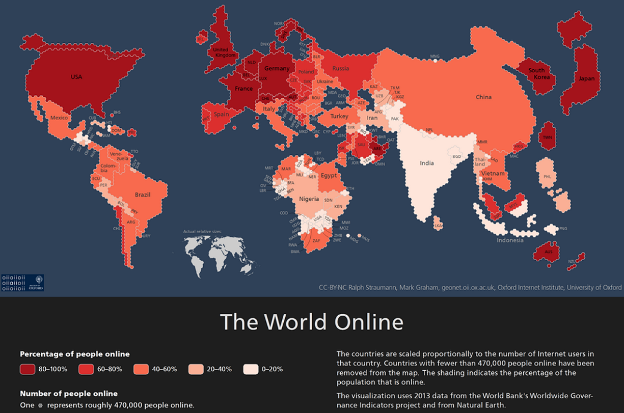
As you can see, geographic area is replaced by # of users. Here’s the methodology:
Each hexagon represents 470,000 internet users and the countries are shaded by the proportion of their respective populations that are online. The little white dot you can see at the top of China, for example, is Mongolia.
The map partially reflects population density but it also flags up countries such as India, which is home to 190 million internet users but still has a long way to go in getting all its citizens online.
So that’s why South Korea is larger than Australia, for example.
(For the record, most streets.mn traffic comes from North America for some reason.)