
Via Fast Company, here’s a chart showing the national CO2 emissions trends from 1990 to 2014, divided up by sector as a percentage of the whole. As you can see, though emissions relative to each other remain largely stable, there is clear trend where transportation emissions are becoming a larger piece of the pie.
Here’s the chart:
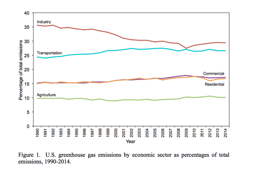
Charlie Sorrel at Fast Company suggests that the increasing transportation share has to do with the increasing number and usage of trucks:
Passenger vehicles and light-duty trucks saw a spike in the early 2000s, but have steadily decreased since then, dropping back almost to 1990 levels (16.1% today vs. 15.6% in 1990). These vehicles still account for almost all (60.7% in 2014) of transport emissions, though. Commercial aircraft have stayed almost the same throughout the period, making up just 1.7% of total emissions today. The biggest growth in transport emissions is from medium to big trucks.
That’s no surprise. According to from the U.S. Department of Transportation, trucks make up just 1% of traffic, but create more than a quarter of all road pollution. Sivak and Schoettle’s study shows that relative emissions from medium-to-large trucks have almost doubled since 1990, from 3.6% to 6.0%. But even more striking is the absolute increase for these vehicles. During this period, greenhouse emissions for trucks grew a staggering 76.3%, while the overall emissions of the U.S grew just 7.3%.
Another factor is the increase in the number of vehicles. Even as cars and trucks are engineered to burn less fuel, we put more of them on the road. Today, there are a third more vehicles on our roads than in 1990.
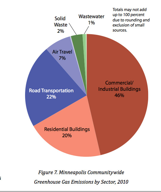 This is at a national level. At a more local level, the picture looks a bit different, as a city like Minneapolis will have less industry and a greater share of its emissions due to residential impacts. (See this chart from the city-wide sustainability report.)
Just something to think about when discussing transportation policy choices. With little global progress on reducing the greenhouses gases causing climate change, the stakes of transportation policy are becoming ever greater.