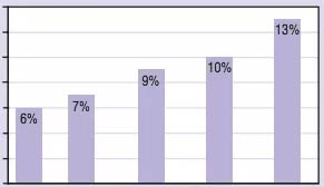
Here’s a depressing chart, ripped from StreetsBlog’s end-of-year post of 2016 high- and low-lights. It uses Federal transportation data to chart the increase in fatality rates for different modes of travel on US roads:
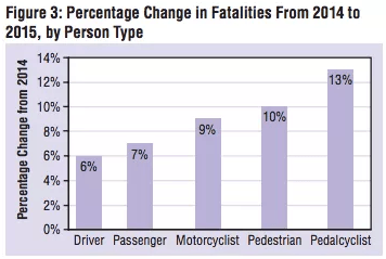
According to the Streetsblog post, the rise in fatalities, particularly for people walking or biking, is a worrisome counter-trend:
Bucking a long-term decline, traffic deaths are now on the rise in the United States. In 2015, the nation saw the biggest increase in traffic fatalities in 50 years, and the trend accelerated in the first six months of 2016. The increase is even more pronounced among pedestrians and cyclists.
Cheap gas and a growing economy have led to more driving mileage, and that surely explains part of the increase, but not all of it. Other factors have been debated, but there’s a growing consensus that in-car distractions like mobile devices and complex dashboard displays are also playing a role.
The trend of pedestrian crashes increasing in frequency and severity is alive and well locally. Most recently in Minneapolis, Barbara Mahigel was killed by a hit-and-run driver crossing Nicollet Avenue. In November, Ker Par was killed by a driver while crossing a street in Saint Paul. That same month, Mai Thi Dang was killed in Burnsville on McAndrews Road. These are just three of many similar Minnesota stories stories from the last year. What do we need to do to reverse this trend?
Cell phone use and a total lack of enforcement of distracted driving laws has to have some effect on the increase. I contacted my CM Elizabeth Glidden about this and she said that Minneapolis doesn’t even have cops that enforce traffic laws. I think this is absolutely pathetic. Everyone should contact their city and state reps.
The linked article lacks any real data, but as the population grows the death tally would also be expected to grow. It would be more meaningful to look at death’s per 100,000 people. But that doesn’t make for flashy headlines.
Yes and no. Per capita comparisons (and per km traveled and running averages and trend lines and …) are critical but that doesn’t invalidate this chart nor raw data comparisons in general.
Specific to this chart, US population growth is about 0.69% per year. Only very rarely does it grow more than 1% in a single year. A per capita version of this chart would not appear appreciably different? There is also the issue that we don’t yet know what the population growth rate was, so in some sense a per capita could introduce a greater level of inaccuracy?
Distracted drivers are surely the main point in this, but pedestrians and cyclists should also remember that they put themselves at risk with cell phone use, headphones, etc. Stay alert!
How large of a role does bad road design play?
Back in my native city of Columbus pedestrian deaths also spiked. It doesn’t help that their pedestrian advocacy group blames pedestrians for being drunk or inattentive.
http://stagenc.build.dispatch.com/content/stories/local/2017/01/08/pedestrian-deaths-increased-last-year-in-columbus.html
Halifax with a population just short of St Paul had zero pedestrian or cyclist fatalities in 2016 and they have drunk pedestrians and kids running into the streets.