Although Minnesota uses its own Manual on Uniform Traffic Control Devices, it’s substantially similar to the federal manual (known as MUTCD). Why? The state can’t get too creative without interference from the Federal Highway Administration (FWHA). Plus, Minnesota has recently been changing our signs to make them even closer to the national standards.
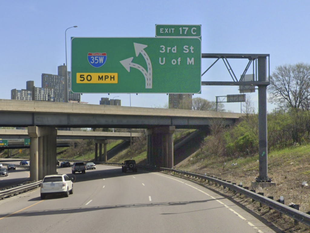
An example of this is how to communicate to drivers where there’s a major multi-lane exit and one lane splits. One way was “diagrammatic” signs. Here’s one at I-35W and the University of Minnesota exit, the only extant example I know of in Minnesota.
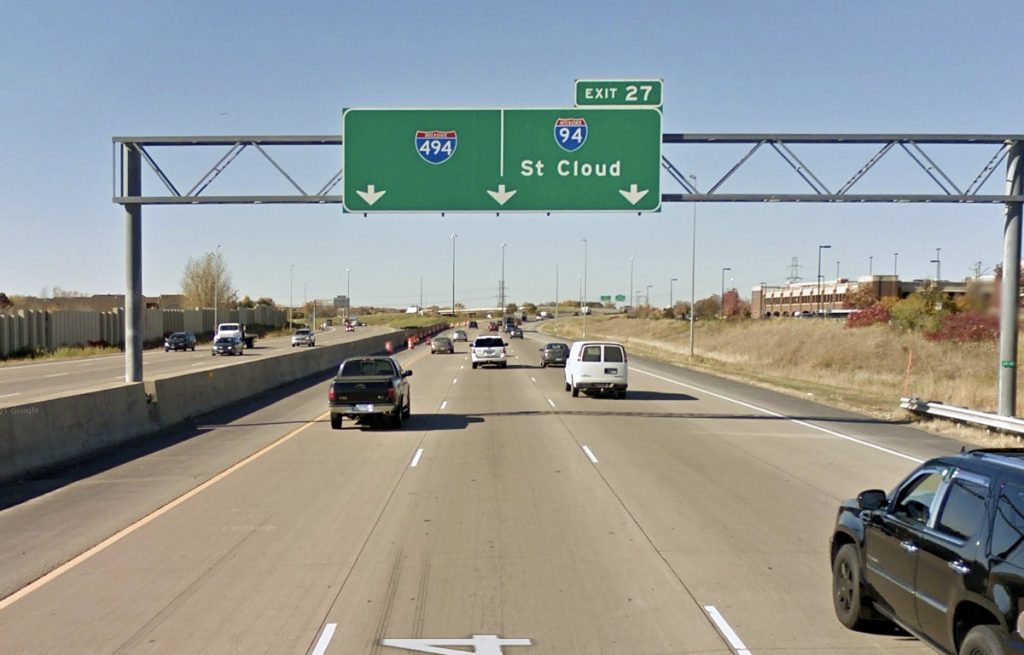
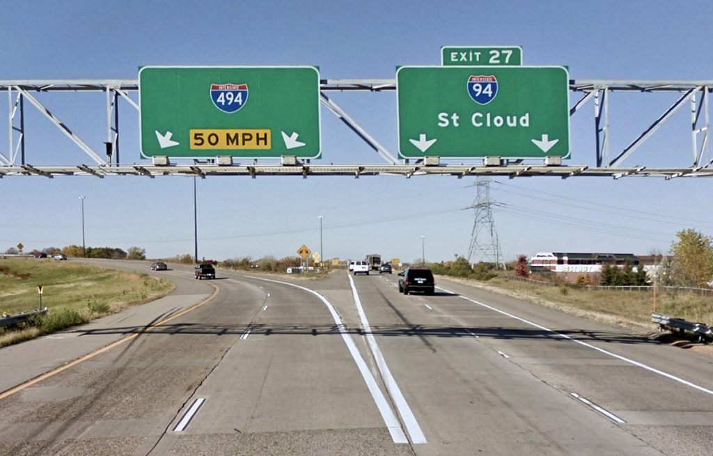
But much more commonly used in Minnesota was a “pull-through” signs, with downward arrows immediately above the gore area, plus a second sign in advance of the intersection.
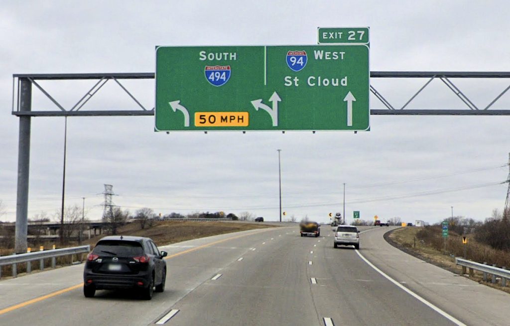
The latest federal MUTCD bans the pull-through signs for new roadways. They are only allowed on reconstruction projects if existing sign gantries — the metal structures supporting the signs — are not being altered. Diagrammatic signs are still allowed but discouraged. Instead, an “arrow per lane” sign is preferred.
One sign is located a half mile away from the split, and a second is one mile away. A third sign, two miles away, is encouraged if conditions allow.
Exit Tabs
Note in the previous pictures how the “Exit 27” tab has been moved from being centered to the right. The national standard is for the tab to be justified on the side where the upcoming exit is. The Minnesota Department of Transportation (MnDOT) has traditionally centered the tabs — likely because they simply thought it looked nicer centered. Justified tabs are too subtle a cue to be useful to the average driver, and left exits typically already have much more explicit signing. But newer signs are justified per the national standard.
Also new are the addition of exit numbers to non-interstate freeways, another national standard that Minnesota has not traditionally done.
County Road Markers
If you’ve ever wondered why you see county road marked variously with white squares and blue pentagon shields, the reason is that the white square is the original Minnesota standard, while the blue pentagon is a newer national standard. Minnesota counties were given a choice as to whether they wanted to switch or not. Some use a mix, with the blue pentagons usually denoting the more prominent county roads.
Although the national standard for the pentagon signs is gold letter and gold numbers, for a number of years MnDOT has used a simplified design on green guide signs omitting the county name and using white numbers.
On new signs going up, like the one in the second photo below, they’re including the full county name while keeping number the number white and somewhat larger than standard — closer to compliance, but not all the way there. MnDOT has applied for official permission to keep doing this. It’s notable that the earliest design of the current state highway markers had gold letters, but this was dropped very early on due to legibility concerns.
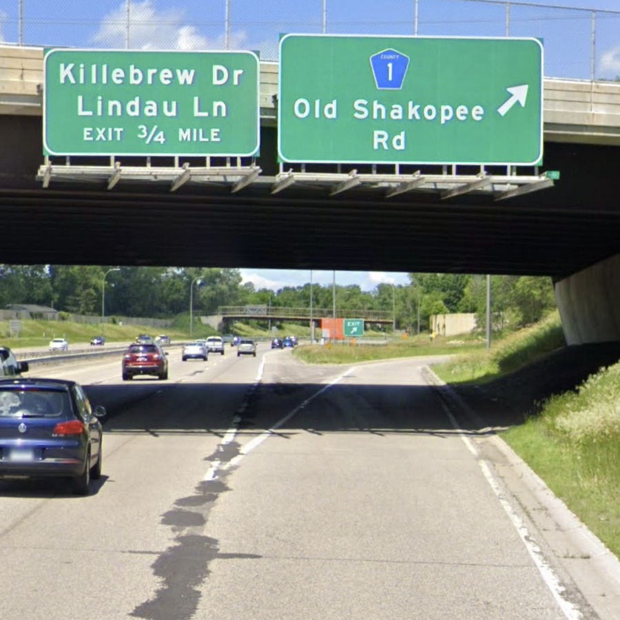
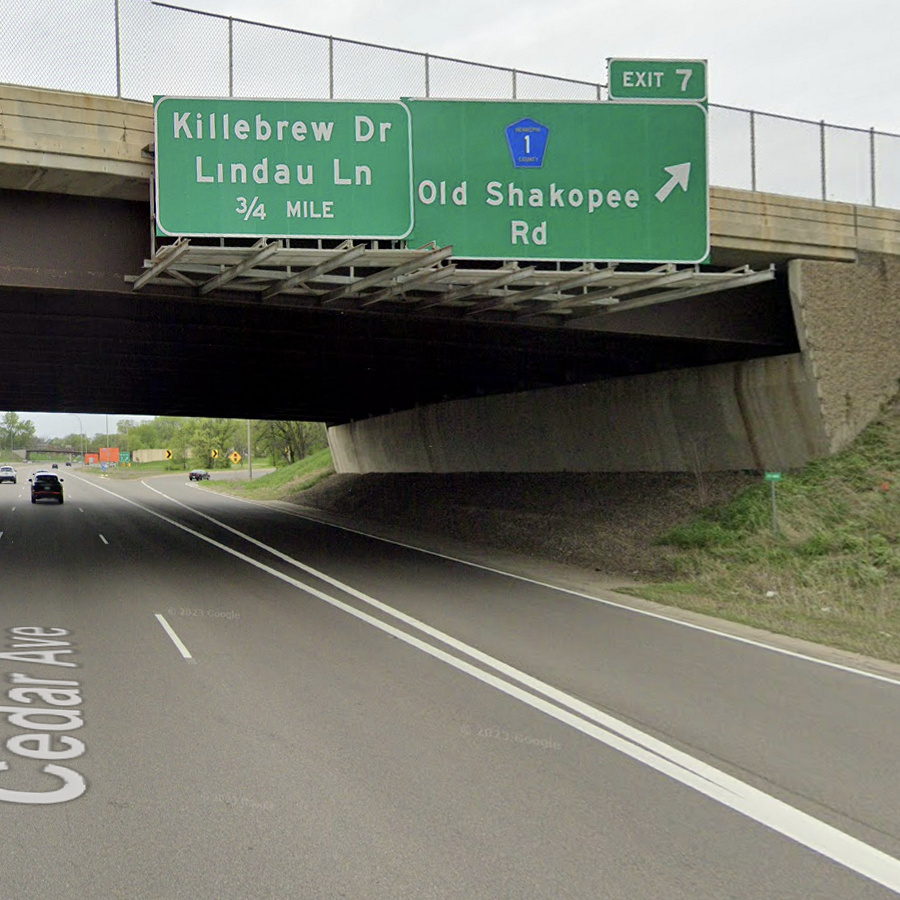
Note also the addition of an exit number.
Memorial Signs Switch to Brown
Minnesota has quite a few honorary “Memorial Routes” that normally honor a person or group of people. With a few exceptions (like the one for Prince that’s purple), they’ve normally been white text on a small green square. Recently the standard changed to a slightly larger sign that has white on brown text.
Despite the honorary names now appearing on Google Maps, these signs are not intended for navigational use; switching them to brown emphasizes this point and avoids confusion with ordinary street signs.
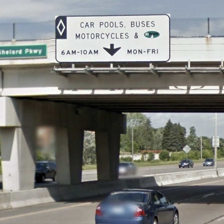
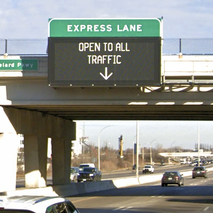
Diamonds Bite the Dust
Although it’s been over 10 years since the the changes, a lot of readers might remember that “Diamond Lane” used to be a colloquial term for the high-occupancy toll (HOT) lanes on I-35W, I-35E and I-394. However, the FHWA has two new directives:
- Diamonds may no longer be used to mark HOT lanes (being reserved for lanes that are restricted at all times).
- Signage must dynamically change to indicate who is allowed to use the lane at the current time, rather than just a static list of time-of-day restrictions.
Diamond markings on these lanes are gone throughout the metro. And while fixed signs still exist, they’re supplemented with compliant electronic signs.