Figuring out which neighborhood to move to is one of the best ways to induce choice paralysis. There are so many places to choose from, they all seem to have their pros and cons, and the stakes are really high if you choose a place that you end up unhappy with. After I moved two years ago, we recorded a podcast episode comparing my data-driven approach to Tim Marino‘s intuition strategy.
Well, I moved again this year, and I had a new spreadsheet in my tool belt this time. I’d like to introduce you to the Friend Density Matrix.
The Idea
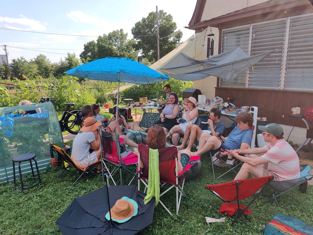
You have a bunch of friends, and you want to reduce the barriers to hang out with them. We are all aware of the loneliness epidemic society is facing, and none of us wants to get caught up in that! And while there are many considerations on where to live, in my experience it is much easier to (for example) find a job that is closer to your friends than it is to convince all of your friends to move closer to your current job.
So, what is the solution? Do you plot out where all your friends live on a map and place a dot at their geometric average? Well, that would minimize distance as the crow flies, but that is usually not the best way to minimize travel time — especially when you travel by transit or by bike. You have to take into account where the safe bike routes are, and rapid transit lines can make two points feel closer to each other even than other locations that are geographically closer. But how are we going to efficiently get that kind of data into a spreadsheet?
Well, Google has a product called Apps Script that lets you program automations that can do tasks within their various platforms. And since it can make navigation requests to Google Maps, this seems like the perfect opportunity for my little project. Inspired by a presentation at a recent JavaScriptMN meetup and with assistance from my friend Ryan Rampersad, I started hacking together a prototype!
The Final Product
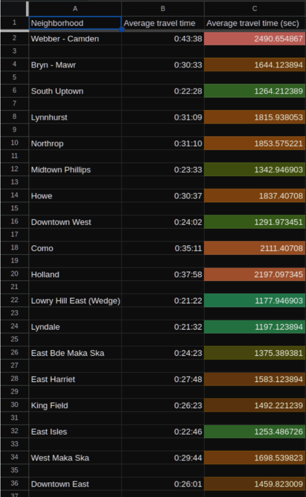
In the end, I created a spreadsheet that allows you to put in a list of friends, their address (or latitude/longitude location) and a weight for each (as in weighted average). It will tell you what the average travel time by bike or transit is from each neighborhood in Minneapolis to each of your friends, based on the weights you assigned to each friend. If you move to a neighborhood with a low number on this spreadsheet, you are theoretically maximizing your access to your friends!
If you live in Minneapolis, you are probably itching to try out this tool for yourself! (For St. Paul or suburban residents, see my comments below.)
Here is what you need to do:
- Make a copy of this spreadsheet so you can edit your own copy. Yes, you need a Google account for this; I am sorry about that, but they only allow Google Maps API calls from an authenticated account.
- In the “Friends” sheet, type your list of friends, how highly you want each friend to be weighted and their address. Do not enter more than 25 friends (more info on that below). For the weights, I found it helpful to think in terms of: In an ideal world, how many times a month would I be hanging out with each friend?
- At the top of the page, one of the menus is called “Friend density script.” In that menu, click on “Run flagship neighborhoods.” This will give you results for 10 neighborhoods that are spread evenly throughout the city (see below about why I split the city into 10 zones). Note: Depending on how many friends you have in your list, it could take a while for your results to show up. In my testing, sometimes it would take over 200 seconds (just over 3 minutes).
- Go to the “Outputs” sheet to see your results. It will display your average travel time in human-readable format as well as in raw seconds (the seconds are color coded).
- Based on which of these neighborhoods score well, you can go into the “Friend density script” menu and click “Run [neighborhood that scored well].” This will calculate travel times for neighborhoods in the vicinity of the selected neighborhood.
- You can do this for as many neighborhoods as you like, but wait until the previous one is done before you run the next one.
- For example, in my personal spreadsheet, the three flagship neighborhoods that scored best were Downtown West, South Uptown and Midtown Phillips; so I ran those three to get a more thorough idea of how the scores appeared throughout that region of the city. In the interest of time, I opted not to run more neighborhoods in other parts of the city, because it seemed unlikely that I would find a surprise neighborhood that scored better.
Note that the “Outputs” sheet lists the travel time for every friend-neighborhood combination, so you can get really detail of your analysis if you like.
Limitations and Future Plans
Obviously this is not a perfect product, and I already have ideas on how to improve it or expand the idea:
- Yes, St. Paul, I know that I did not include you in this spreadsheet. It shouldn’t be difficult to create a version of this spreadsheet for St. Paul (or any city, for that matter); the most time-intensive step would be compiling a list of the locations of the centroids of all of the neighborhoods you want to include.
- The API calls to Google Maps take a long time, and each user account is limited to 1,000 requests per day. Given how quickly the number of requests grows for each friend you add (nested for-loops are fun like that), it necessitated I split the city up into 10 groupings of neighborhoods and limit the number of friends to 25. I suppose I could allow the user to cut down on time by choosing only one mode of transportation.
- The travel time results are, of course, limited to only take into account what Google Maps is aware of.
- It probably does not know about the best bike shortcuts in your city.
- It can not plan trips that use both bike and bus the way that the Transit App can.
- It does not know about future transit routes, even ones that Metro Transit has already announced like the extensions of the Gold and Green lines. This was particularly important for me, since the Gold Line will provide a rapid single-seat trip from downtown Minneapolis all the way to my parents’ place on the East Side of St. Paul. I corrected for this by estimating what transit times will look like for that route and manually updating the values in my parents’ column after the outputs had been calculated.
- I would love to have a map of the city, with each neighborhood color-coded to match its results in the Outputs sheet.
Now, nothing is forcing you to use this spreadsheet to plan trip times only to friends’ homes. You can include any locations that are important to you! I’d love to hear some creative uses that people come up with for this spreadsheet, and I welcome any feedback on how to improve it! Drop me a line at [email protected].
Also, this tool is not going to tell you all by itself which neighborhood is going to be best for you. I recommend incorporating this knowledge about friends’ locations with information like neighborhood walk scores and the service areas of Evie and USI and other amenities that you care about.
It is also important to note that this only gives average travel times; if your friends are spread out, it may very well suggest a neighborhood in between your friends, but not really close to any of them. Combine these sources of information, and use your human knowledge to augment the data. I have found this to be an invaluable approach to finding the right area to start looking for housing!