
If you ever attend a neighborhood meeting in Saint Paul (or probably any city), you’re likely to hear a lot about the perceived or actual animosity of homeowners against renters. For example, in my own neighborhood in the North End, a recent meeting drew some audible expressions of surprise when someone quoted the statistic that well more than half of the neighborhood’s homes and apartments are rented and not owner-occupied, one of the highest percentages in the city. This, however, made me wonder: what do these numbers actually look like?
To try and visualize these numbers, I took the data on residential properties in Ramsey County and colored them by whether they were homestead (owner-occupied) or non-homestead. This is the result:
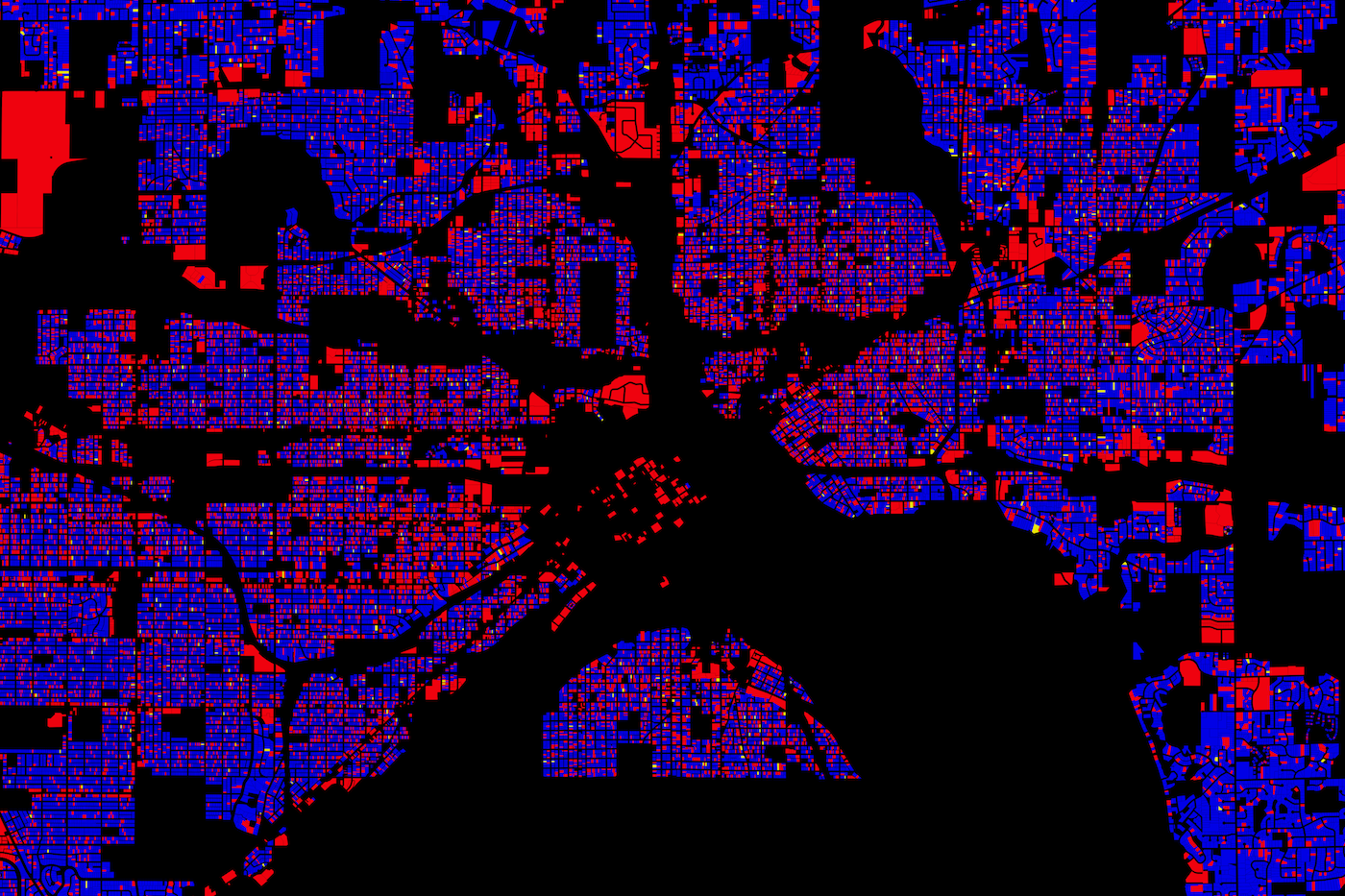
Homestead status in Saint Paul. Click to zoom.
Blue = homestead (owner-occupied)
Red = non-homestead (non-owner-occupied), also condo
Yellow = Mixed (usually duplexes)
First, a caveat. This dataset doesn’t distinguish condo buildings (many owner-occupied) from rented apartment buildings, so that a number of neighborhoods in wealthier parts of the city (especially downtown and the area between St. Clair and I-94) are much redder than they would otherwise be. Even with that caveat, however, some trends are immediately visible. Red properties are clustered especially in the areas nearest downtown, along major transportation corridors, and near certain colleges and universities. In general, this is as expected. But some more interesting traits become visible if we zoom in.
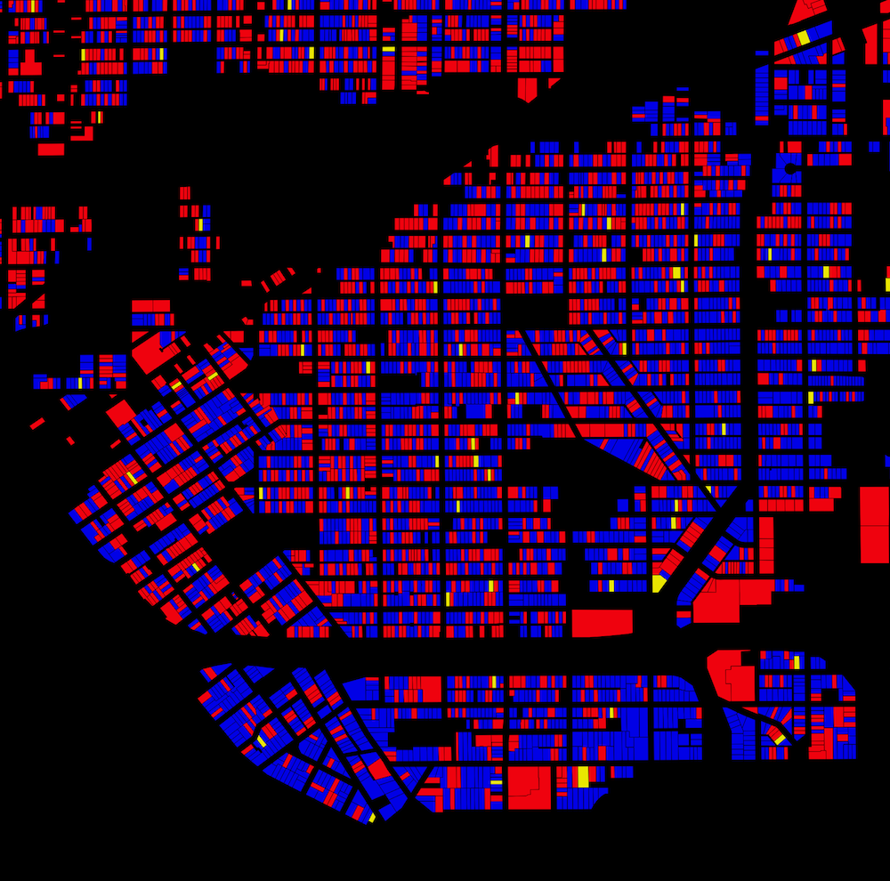
Dayton’s Bluff
Dayton’s Bluff is another high-renter area, and rental properties are scattered fairly evenly throughout the older part of the city. One place this proves abruptly untrue, however, is in the area south of I-94 (the prominent east-west empty band near the bottom), where the relative numbers of rental and owner-occupied properties seem to almost completely invert. This area is near Indian Mounds Park and has some impressive views, so the difference is not necessarily surprising. Still, it is striking visually.

Frogtown (Thomas-Dale) and Hamline-Midway
Another dramatic border is visible between Frogtown and Hamline-Midway, the border between which is Lexington Parkway (that broad road in roughly the middle of the map). The housing stock in Frogtown is significantly older than that in its neighbor, and much of it is in worse condition, in many cases at least partly due to the failures of inattentive landlords. But much is simply based on neighborhood perceptions; the difference between houses in the blocks east and west of Lexington are not so dramatic that they would prevent homebuyers from purchasing those properties instead of landlords or speculators.

The North End
The North End has a lower overall homeownership rate than Frogtown, but nevertheless appears visually to have a higher percentage of blue properties. In fact, many of the neighborhood’s renters live in two highly dense multi-family areas; the 580-unit McDonough Homes public housing, visible as a large red rectangle in the upper right, and a diffuse belt of postwar apartment buildings in the northern half, running south and then southwest.
You can download a much larger version of this map (10,000×6666) from Dropbox here.