There’s a very cool new report out from the Institute for Transportation & Development Policy titled “Indicators for Sustainable Mobility.” The study attempts to boil down what makes a transit-friendly city into a few simple measures, attempting to solve what they call the “black box” problem of many transit metrics.
The study looks at Minneapolis and other cities in North America and tries to evaluate how the city does along some basic metrics of proximity of jobs, people, and housing to good transit.
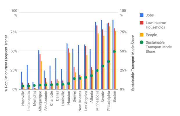
For example, check out this chart, that gives a general overview of the situation:
Here are two more charts showing how Minneapolis stacks up. On the left is “frequent transit”, and on the right is “rapid transit”:
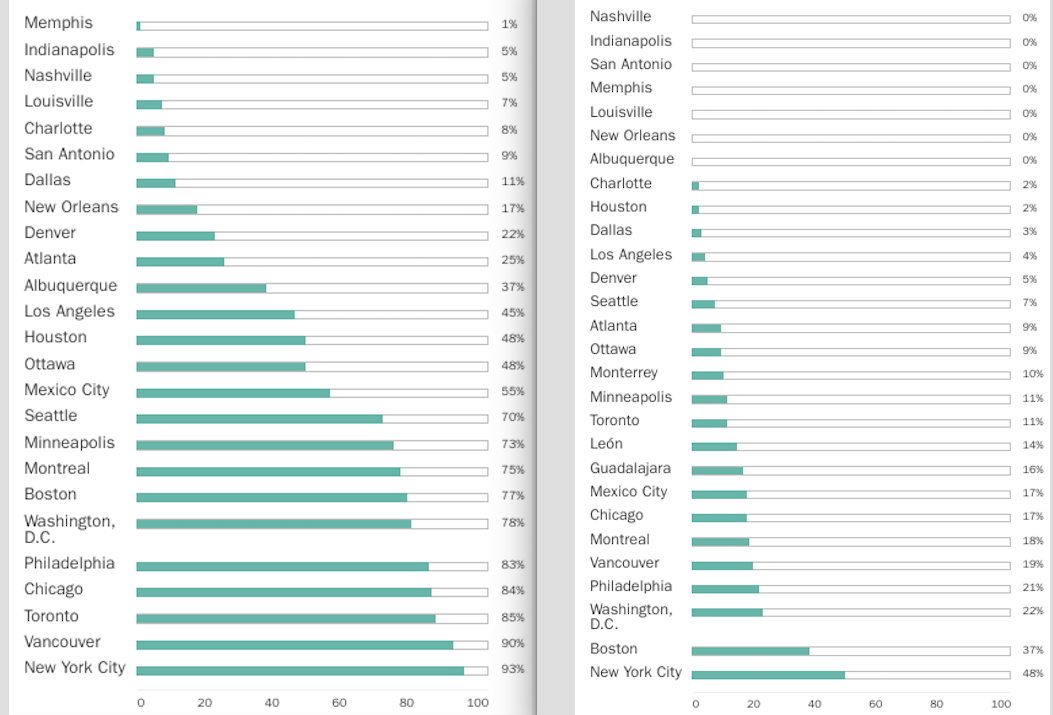
“Near to frequent transit” is defined as “a roughly 10-minute bike ride or walk of a transit stop … served an average of five times an hour”; rapid is defined as “any Bus Rapid Transit (BRT) corridor, LRT corridor, or rail-based transit mode that meets the BRT basics definition in the BRT Standard.”
As you can see, lacking much dedicated right-of-way, we don’t have a lot of “rapid” transit in Minneapolis. The city also underperforms its potential for “sustainable mode share,” with far more people driving around than theoretically would have to, given the density and accessibility of people and jobs within the city.
Check out the whole report and the interactive website. They are both full of great data.
PS. The usual caveats about city size and comparisons are in play here. The study uses civic boundaries to compare places, and Minneapolis is small.