One of the things you get to see when you walk instead of drive is tile entryways to commercial (and sometimes residential) buildings. I’ve been collecting photos of tile for a while, mostly from somewhere other than the Twin Cities.
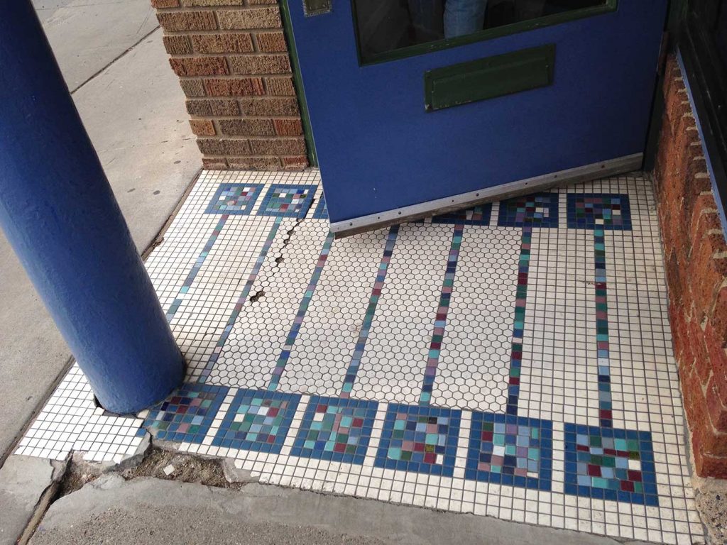
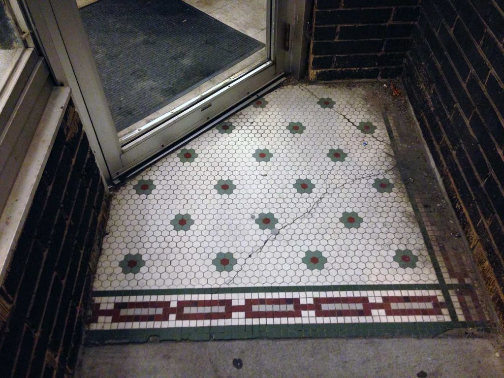
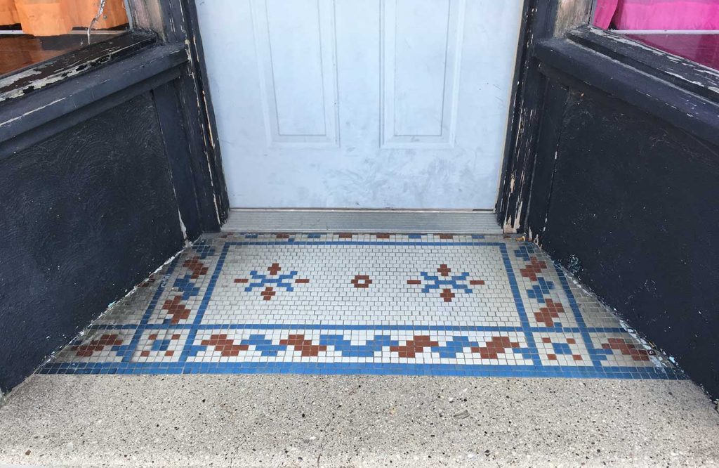
Some of the designs are decorative only, as in the first row of images. Semi-floral, snowflake-like, or just an assemblage of square mosaics, they make a welcome mat that never trips you as you enter.
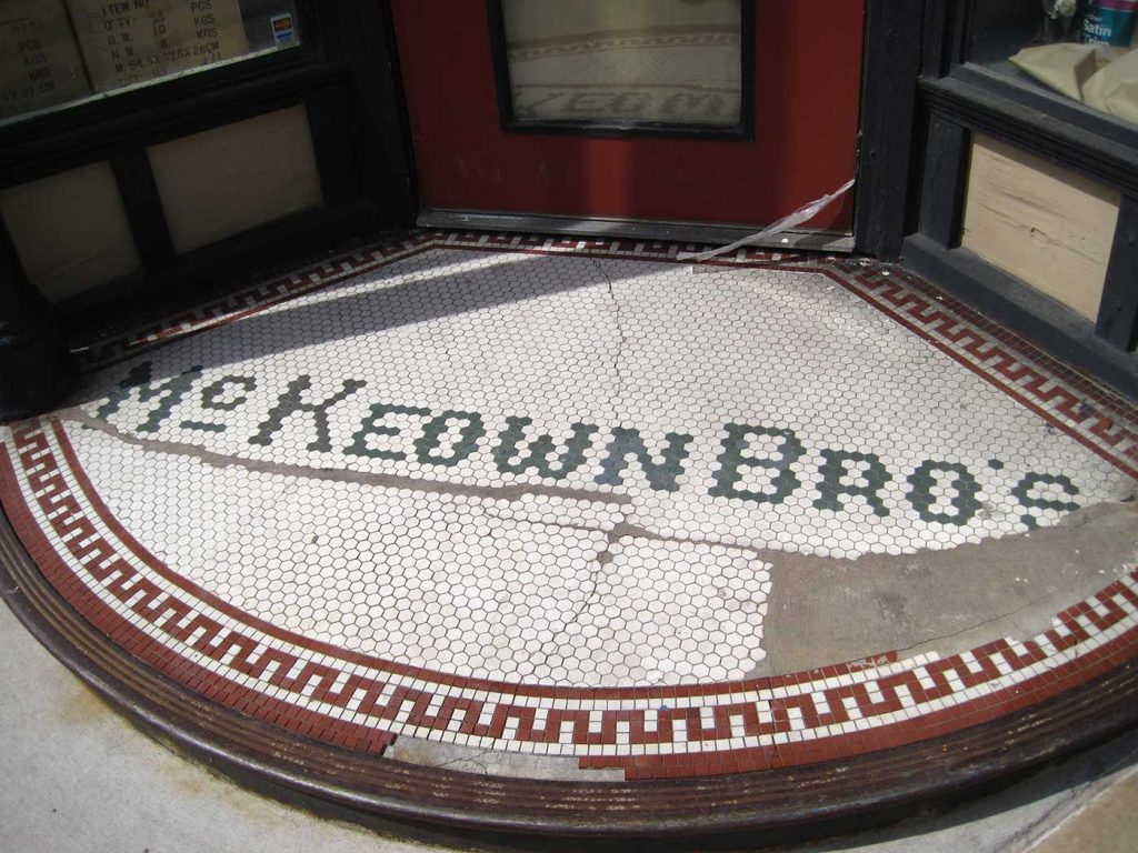
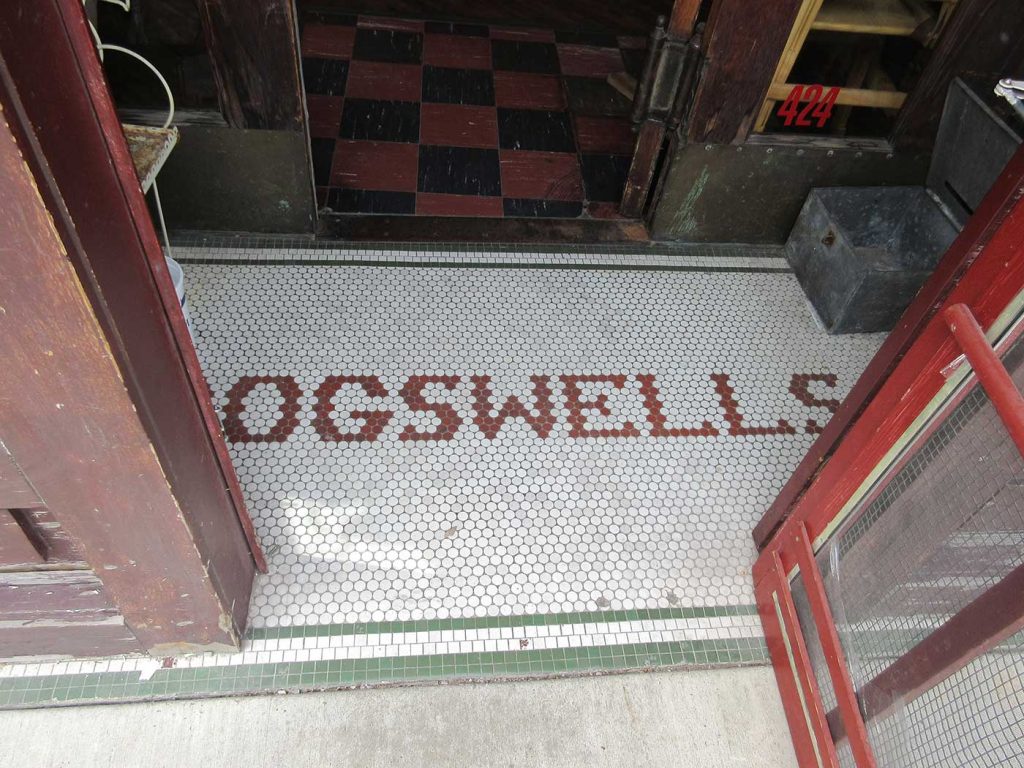
Usually, though, the name of the business or the building is a focal point. Some, as in the second row, combine major decorative elements and words. The “askaris” remnant is fun because it’s a hexagon pattern made of hexagon tile, plus it has script lettering which is particularly hard to do in tile. The Butte Floral design comes the closest to feeling like an actual carpet and has perhaps the most beautiful border I’ve been lucky to see in the U.S.
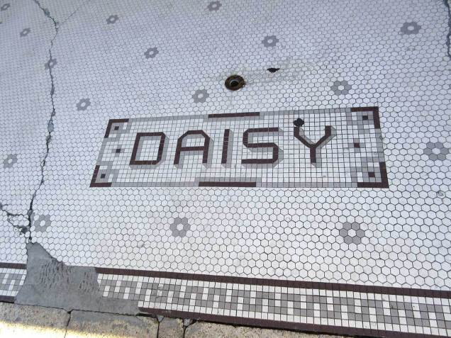
The third row contains one of my favorites: the metallic gold tree of Arenz Shoes in La Crosse, Wisconsin. Next to it, the black and white remnant from Butte, Montana, looks like it was one of the nicest scripts I’ve ever seen in tile. And the Daisy letters from Memphis, Tennessee, have the most creative drop-shadow I’ve recorded.
And this is where you realize that tile letters are designed the same way that bitmap letters are (also called pixel fonts), and that guides your understanding as you look at the rest of the samples.
-
- 31st Street west of Hennepin.
-
- Lake Street between Bryant and Colfax.
-
- Two Rivers, Wisconsin.
-
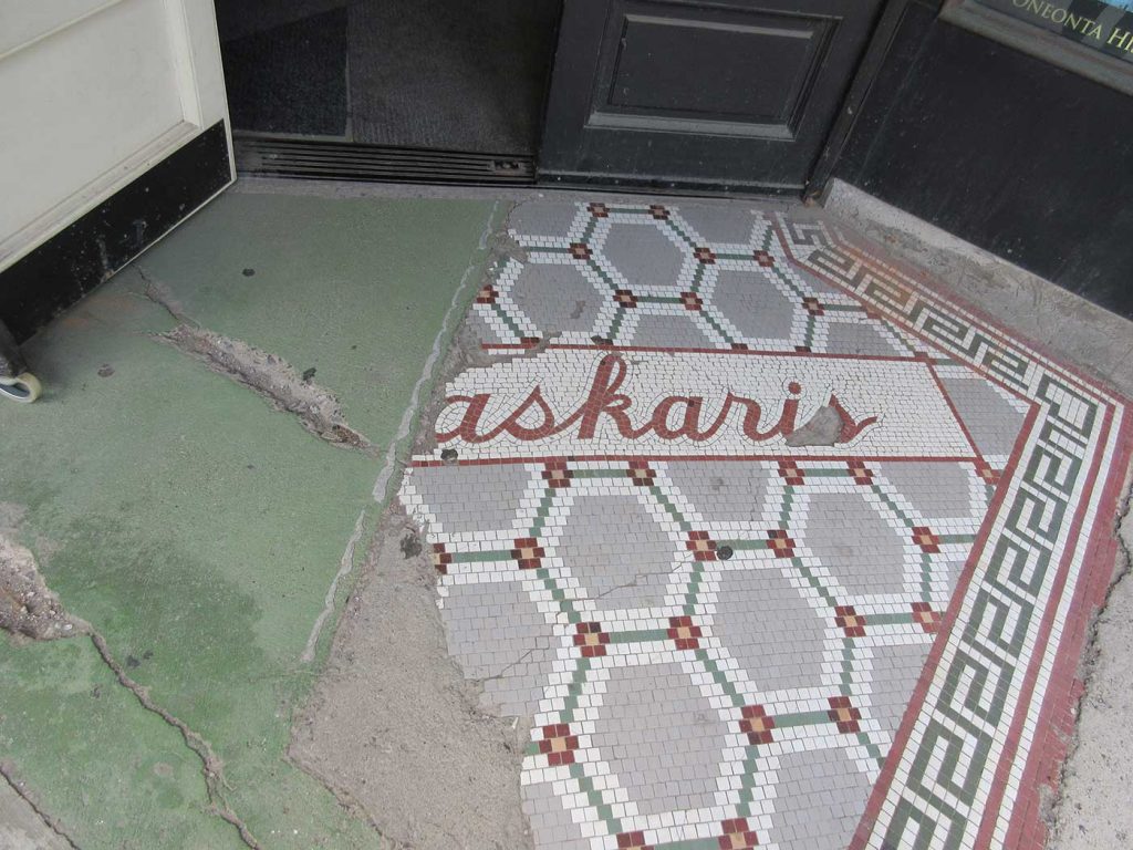
- Oneonta, New York.
-
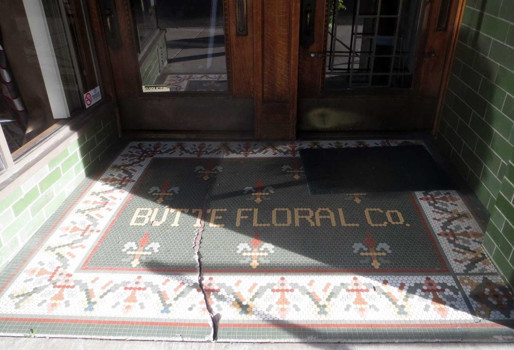
- Butte, Montana.
-
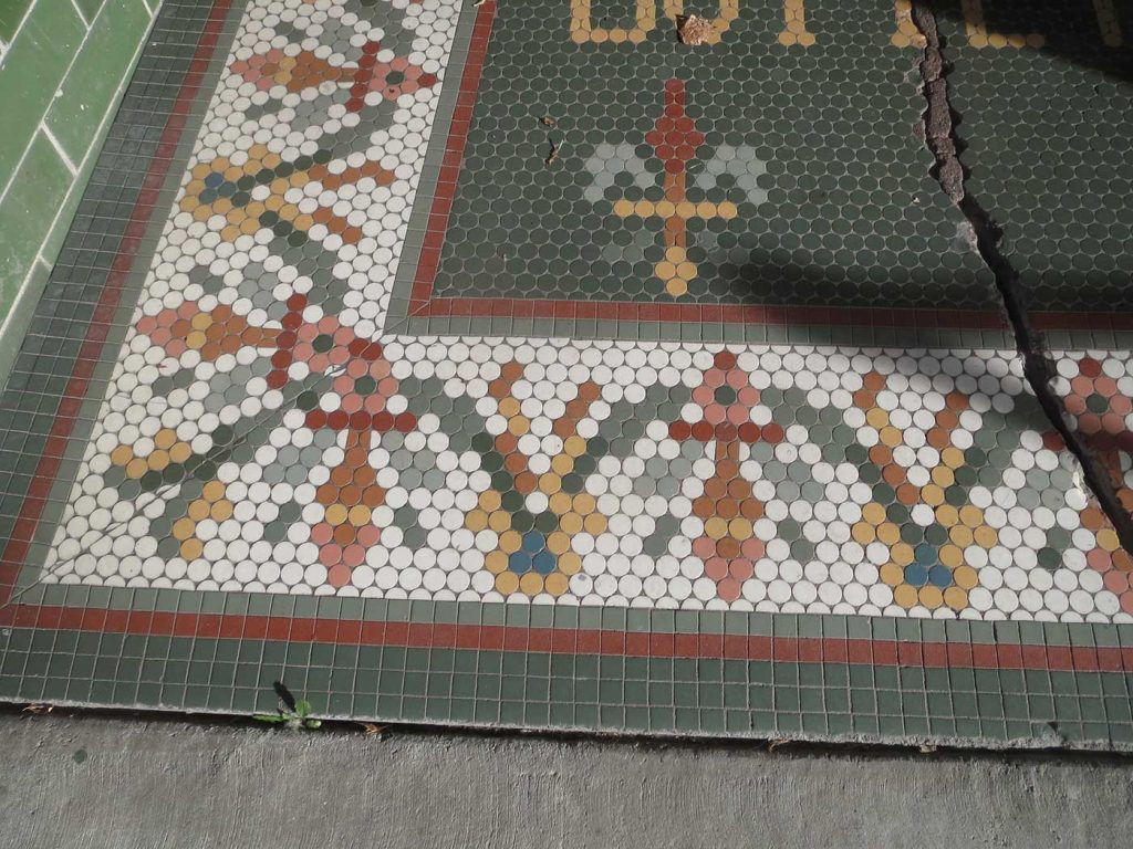
- Close up of the beautiful border of the Butte floral shop entry.
-

- La Crosse, Wisconsin.
-
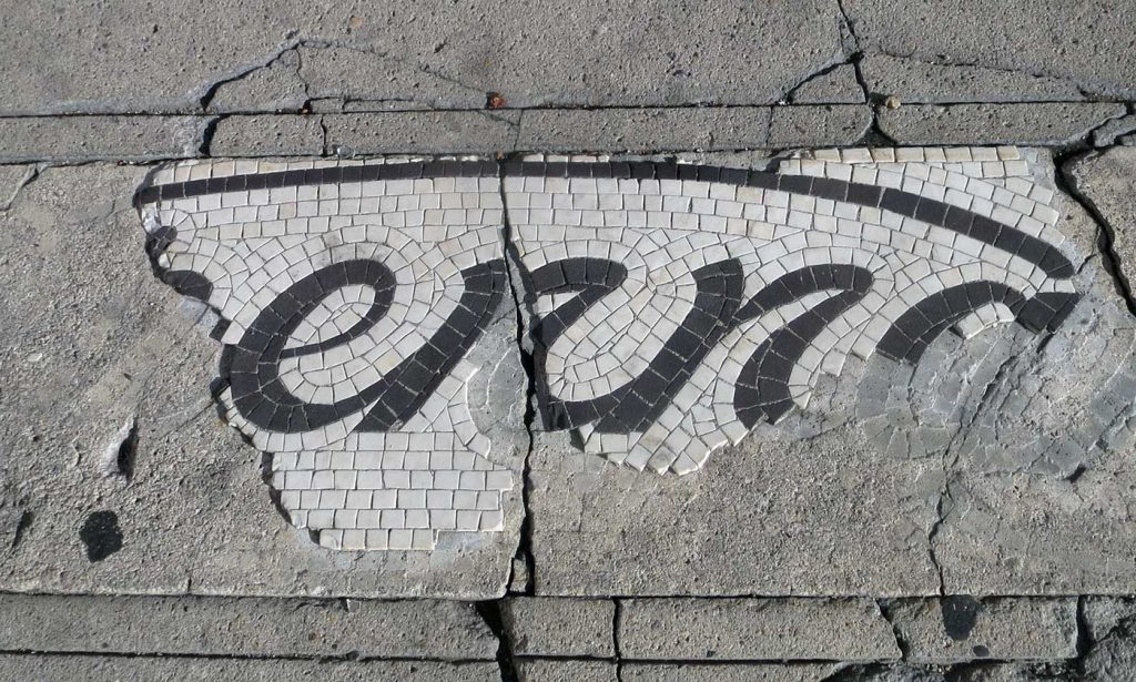
- Butte, Montana.
-
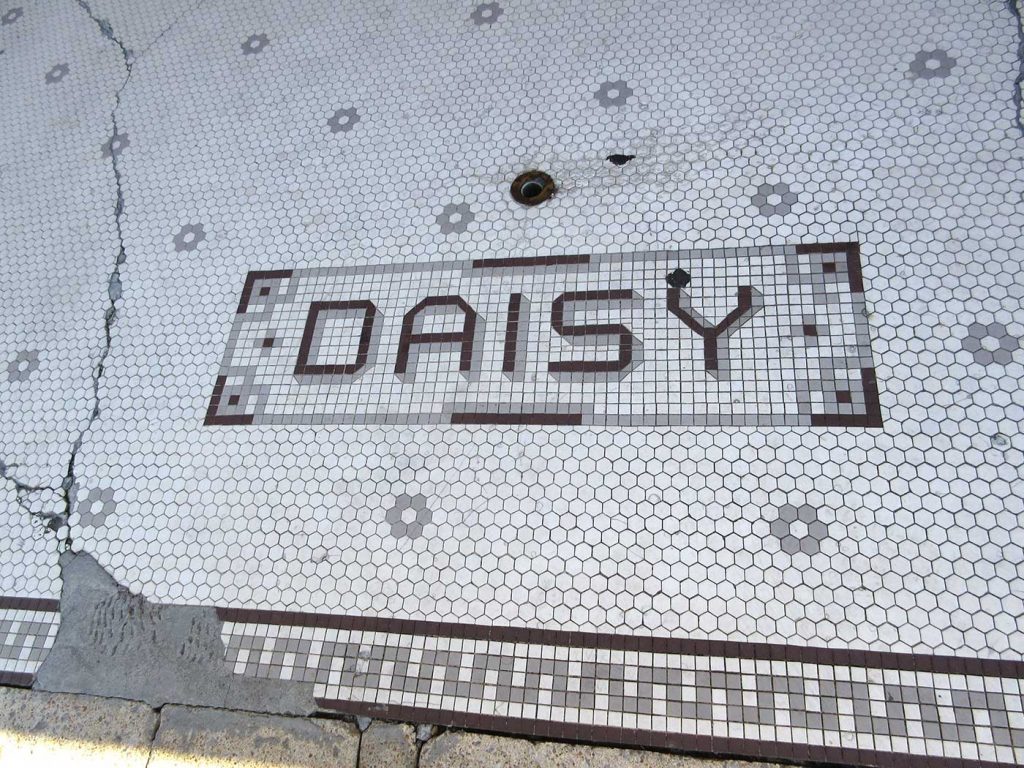
- Memphis, Tennessee.
-
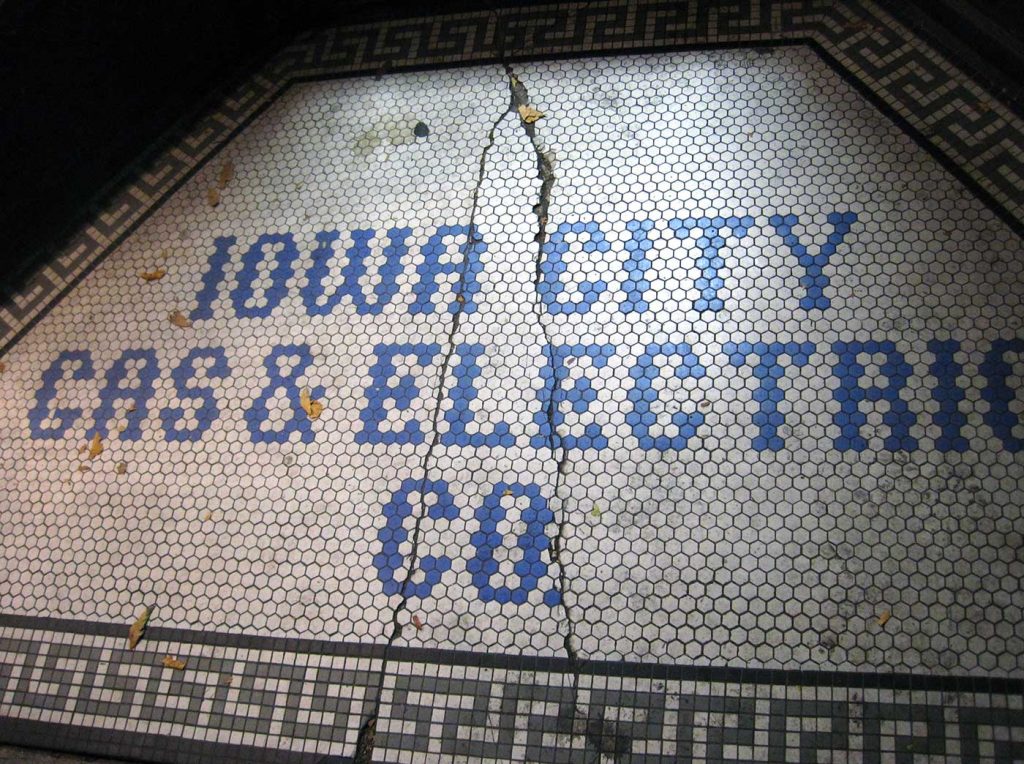
- Iowa City, Iowa.
-
- Iowa City, Iowa.
-
- Pittsburgh, Pennsylvania.
-
- Dubuque, Iowa.
-
- Bellingham, Washington.
-
- Moscow, Idaho.
-
- Olympia, Washington.
-
- Bellingham, Washington.
-
- Salem, Oregon.
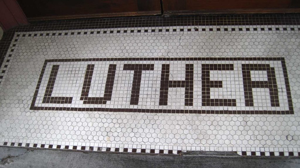
Think about how hard it is to make the Roman alphabet out of one or two rows of squares or hexagons. Contemplate making a curve out of squares. Check out the R in LUTHER and realize that’s why it looks more like an A than an R. The tile-layer should have cut those two tiles along the center of the right edge into triangles and put in triangles of white to represent the curves, right? I wonder why they didn’t. (Or maybe it really does say LUTHEA. Who knows?)
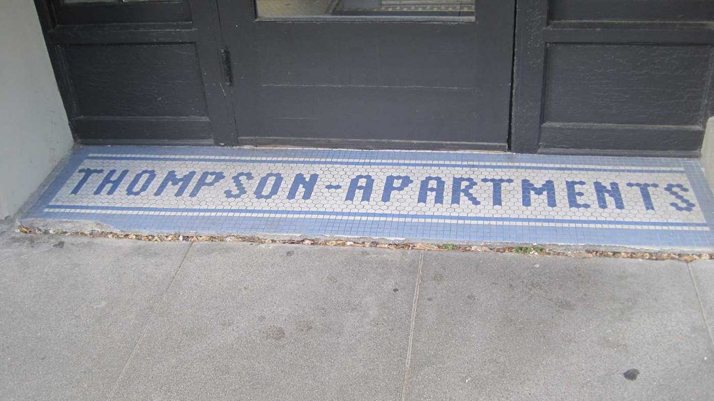
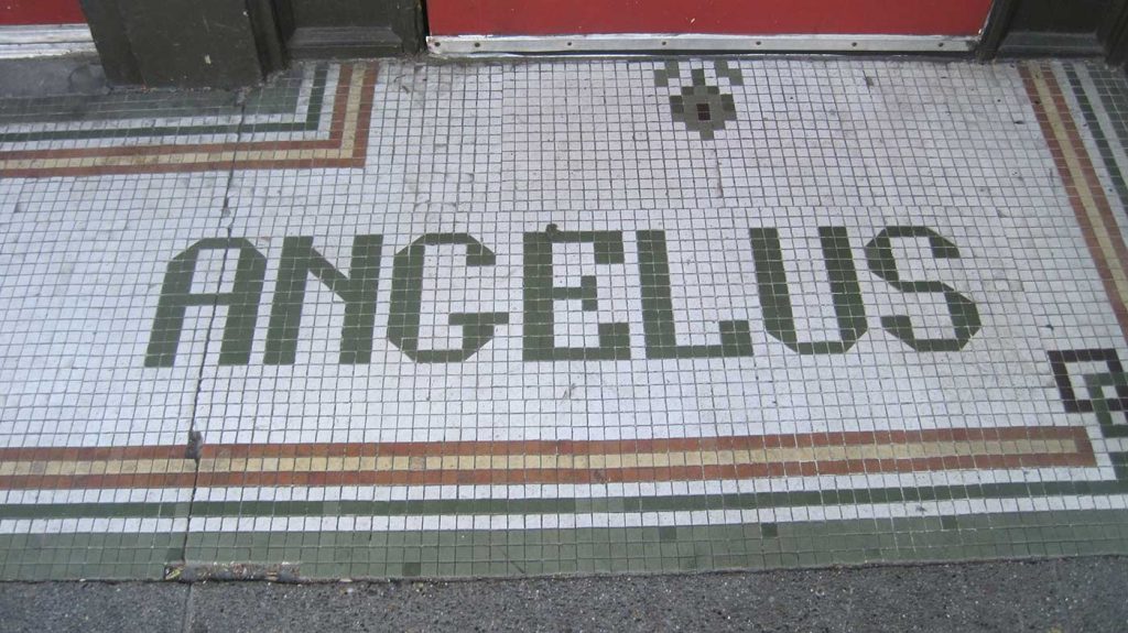
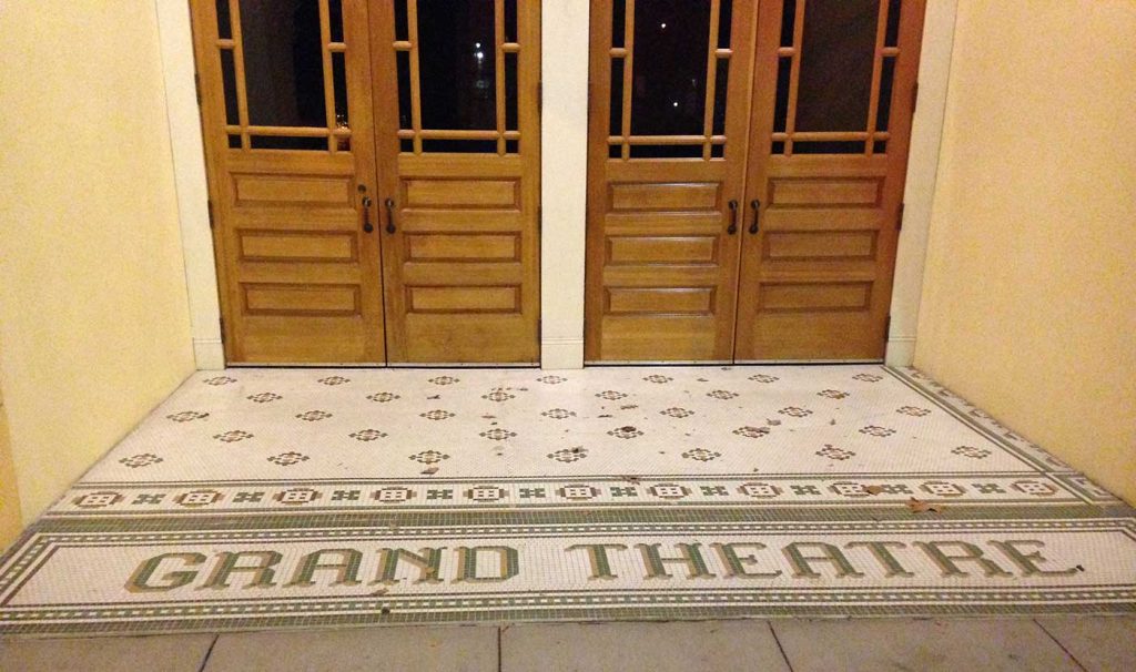
The last three rows of entries, seen in fairly divergent parts of the country, all feature the same approach: centered letters with a light background surrounded by a contrasting border. The differences are in whether serif or sans serif letters were chosen, how many colors are use, and how complex the border design is. Most are probably early 20th century, though I suspect the Angelus tile is more recent and the final image, from the Grand Theatre in Salem, Oregon, is new (though possibly a restoration).
Watch for tile on your next walk around the city. I’ll be on the lookout for more local examples myself.